Thursday, March 25, 2010

New Post, Yay!

So this week has been really slow and I'm exhausted as wellas missing March break but I have been getting some work done. This week I've worked on my construction machinery assigment in Photoshop (editor). It's coming along well and hopefully I'll have finished it by the end of class. It currently looks like this:


I also worked on a design for the walls in my room, it looks like this:


Lastly I just found out that I have a project in this class.

It's due tommorow.

SO I'm going to go work on that and update today instead of tommorow so I have time to actually work on that.

Wednesday, March 10, 2010

So I've decided that I'm going to put up my blog post early so I have time to work on my SlideShow in Comm Tech tomorrow. This week has been pretty calm. A lot of students have left to start their March break early. The Paris/Spain group left today and the school seems a lot bigger with it's lack of students. Though the lunch line has been way shorter.

I'm still working on Johnny Rotten but had an epiphany the other day. I started fresh. I used one of my old boards and he's actually coming along well. He currently looks like this:


I think I might be able to finish him by Friday. But I'll be on March break by then and I'll have more time to draw anyway.

Well that's it, I'm off to enjoy my free time now because I can :)

Character Attributes Poster

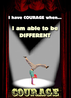
Recently I was told to create a poster based on the character attributes for students at Korah. I chose courage and created a poster using one of the performers in Seussical the Musical.

This is what I came up with:


There were also some questions that went along with it.

Reflection Sheet:

1.Describe how any of the design principles were used in the design of your poster. Be specific and use examples from your poster.

The principles of design are balance, proximity/unity, alignment, repetition/consistency, contrast, and white space. I think my poster used proximity/unity, alignment, repetition/consistency, and contrast. I used proximity/unity when I created depth by making my figure smaller and using large curtains. I used alignment when I placed my text and figure. I used repetition with my font and by using symmetry when it came to my background. I used contrast by using light font, a bright figure against a dark background.

2. What font(s) were chosen and why?

The fonts that I used were EDDIE and CLOWNINGWAY. I chose EDDIE because I wanted the lines that were used to describe courage to stand out but at the same time complement the writing underneath it. I used that font twice but in different sizes (36 and 48pt) and in the colours white and off white. I chose the CLOWNINGWAY font for the word COURAGE on the bottom because I thought it was very circus-y. I liked that because the picture that I cropped was from the circus scene in Seussical. I thought it suited the setting in the poster which was a stage.

3. How was colour used to attract attention?

For my background I used darker and more faded colours to really make the figure and the writing stand out. To draw more attention to the figure I created some spotlights, using grays and whites against a black background. I also used really light font colours, going from white to off white to a very pale yellow, in a descending way in order to pull the viewers eye in the direction of the figure, the colours helped with that process.

4. List any problems that were encountered in the design of your poster?

A few problems that I faced were creating good setting for the figure and making believable spotlights. The reason I cropped the figure was that the background wasn't what I wanted as it was unfocused. But by cropping the figure I had to make a new background and it took a while to decide on a decent setting. I settled for another stage and I pulled a picture of curtains from Photoshop. I then used a wooden floor image and adjusted the colors on it to make it appear darker. Then I took my figure and placed him accordingly, solving my background dilemma.
The second problem I had was the spotlights. As soon as I decided on a theater setting for my poster I knew I wanted spotlights on the figure to really make it look like a stage. So again I pulled a picture up, this on of a single spotlight. I then copied the picture and placed it but encountered my first problem. The spotlights met in the middle and overlapped each other, in a real picture when spotlights overlap that area is lighter. I had no way of creating that in Photoshop. So I tried to blur the image and erased the lines outline of the second spotlight to make it look more realistic. It turned out pretty well and so I left it as such.

5. List any improvements that could've been made to your poster.

I think that I could've improved the spotlights in my poster and possibly picked a different font for the first two lines of writing.

6. Rate the overall quality of your poster based on a level of 1-4, with 1 representing poor quality and 4 representing excellent quality.

I believe that the overall quality of my poster, based on a level of 1-4, should be a 3.

Monday, March 8, 2010

Johnny Rotten Is Giving Me Greys

So last week was interesting, I mainly worked on my poster and was given a new assignment. Sam and I are going to be creating t-shirts for the peer mediator and it's pretty cool. We also had a quiz in Comm Tech and of course I was studying minutes before the quiz. All through last week I was also diligently working on the Johnny Rotten picture for my friend. I've got to say that this is the most irritating and time consuming piece I've ever attempted and I decided to scrap it earlier on today. I've now started a new, larger version and it's coming along a lot better then the first. The highlight of my week would have to be seeing Alice in Wonderland.


I really liked the movie and thought visual effects were fantastic. The colours were lush and the scenery whimsical. I adore Johnny Depp and it was no surprise that he created another unique character. I also thought that Mia Wasikowska did a really good job as the main character Alice.

Monday, March 1, 2010

Currently Listening To: Giving Up The Gun

Well long time no speak, my dear blog.

Things have been hectic for the last while and so updates have been pretty much non-existent.

That said I'll guess I'll just fill you in on what you've missed.

Since my last blog I have been catching up on all my school work. From Philosophy to Comm Tech, everyone seems to be giving me homework these days. But I'm getting by and slowly getting back into the swing of things. I've decided to drop one of my courses, grade 12 Vocals, because I can't sing a note and Mrs. Williams, the music teacher, can't even salvage a voice like mine. It's okay though, I now have a free 4th period and get to leave early every other day which is pretty awesome.

I've just been told by Jenn and Sam that I shouldn't be babbling on about my other classes and that Mr. Wrigley is more concerned with what I've been doing in here.

Which hasn't been much, I'll admit.

In Comm Tech I've only just gotten used to Photo Shop, and am getting better with Sam's help, I've been using it to create a poster for one of the Character Attributes of Korah Collegiate. There are 12 Character Attributes; caring, citizenship, cooperation, courage, fairness, honesty, integrity, leadership, loyalty, perseverance, respect and responsibility. I've chosen leadership for my poster and am using pictures from Seussical the Musical to make it.

I'd actually finished a lot of it before I began a second project. Sam and I were supposed to be making t-shirts for a club here at school and to practice we each made our own designs. Sam drew her inspiration from Billy Talent and I from Andy Warhol. I made a simple Coke bottle cap design for a bag that used only red ink. Once I finished my design we quickly got a screen fixed up and last Friday we attempted to silk screen a bag.

It really was a good effort and for the first half hour things seems to be going smoothly. The exception being that the screen ricocheted back, hitting me in the chin, and leaving me with a sizeable bruise. Then, of course, the heater nearly crushed my finger.

It was the beginning of the end.

But we continued on and out first two prints turned out fantastically. They weren't perfect, but they had a rustic feel that worked and I thought I would be sporting a new bag by the end of class. But on the third printing I messed up and the ink smeared across the bag. It was finished but by then I had a bruise covering my and a sore finger so I didn’t mind that much.

Overall it was an eventful class and that’s what you’ve missed.