This is my final exam post, I have to answer 2 questions on communication technology, enjoy:
Where is Communication Technology headed over the next decade?
I think that Communication Technology is headed to great places over the next deacde. I think that people will still blog and communicate in various ways but I think the technology will defiently improve. I think tablets will be huge. I think that laptops will still be around. I'm wondering about paper and wether print will be as popular as it is now. It may very well be obsolete. I also think communicating through emails and facebook will be very popular.
How will you be commmunicating when you finish post secondary education or in 5 years time?
In 5 years time I will be communicating through emails, and letters and of course, the telephone. I think cellphones will adapt and change, becoming smaller and more developed touch screen capabilities. I think emails, through facebook or hotmail, will still be used, by myself especially because I hope to be travelling. I still think I'll be sending letters to people, be it postcards or 10 page long letters. I don't think I'll have changed how I communicate, from finishing post-secondary to 5 years from now, because I prefer these methods of communication.
Friday, June 18, 2010
Monday, June 14, 2010
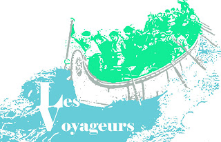
Les Voyageurs Logo
A little while ago my class was assigned the task of designing a logo for an elementary school's new french program. Their slogan was "courage to explore" and the title was Les Voyageurs. I thought it would be cool to make the logo of old school explorers, discovering new places and such. I knew I had 3 colours to work with: blue, green and silver, and so I found an image I liked and created an ink drawing using those colours. It turned out really well and looks like this:

Slideshow Presentation
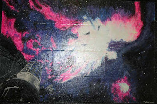
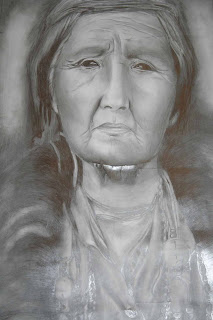
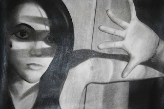
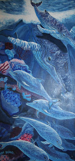
One of our projects was to create a slideshow with the pictures we've taken using the skills we've learned in this class. For my slideshow I took pictures of the art in my school. t showed how creative the students were, the art ranged from murals to paintings and it was all amazing. This is some of the art I took pictures of:


Chapter 6 Questions
I recently finished my Chapter 6 Revuew Questions, this is how they turned out:
Chapter 6 Review Questions
1. Describe how digital video editing evolved starting in the 1990's.
Digital video editing has evolved starting in the 1990's through the use of revolutionary video capture technology that were introduced in 1995, most notably was the Miro DC30 video capture board. There was also the world's first non-linear system called the MX1000 by Panasonic in 1996. There was the development of cameras using the fire wire technology and processors that jumped from 486's running at 66Mhz to Pentium IV's running at 2.4Ghz (2400Mhz) designed in 2002..
2. There are three types of editing methods. Name each of them and describe when you use each type.
The three types of editing methods are edit as you shoot, tape editing, and computer editing.
Edit as you shoot is the method of editing that requires the most planning, all of the shots, angles, and camera movements need to be planned out.
Tape editing is slowly being phased out due to digital editing but it is preferred over it when it comes to straight cuts from one shot to the other because it be quite time consuming if done on the computer.
Computer editing is the most popular type of editing, it is very affordable and even the average consumer can produce a professional looking video with their home computer.
3. What information is contained on the Edit Decision List?
The information contained on the Edit Decision List (EDL) is the raw video footage you've shot. The are many parts to it including Information Area and the “Details” Section. The Information Area has the Tape Number, the Title of the Production, the Shoot Date, and who logged the tape. The “Details” Section has the beginning (Time In) and the ending (Time Out) point for each raw footage shot, Description, Proposed Length on Master, the Order, and the Used.
4. Define Editing Style. What are the 2 types of editing styles outlined in this chapter? Give 2 characteristics for each of these styles.
Editing Style: the distinct way in which an editor makes decisions about length of cuts, which shots should follow each other, and the overall look of the video.
2 types of editing styles outlined in this chapter are editing to the beat of music and pace editing.
Editing to the beat of music is the most common style of editing as well as the easiest. It is done by uploading music into your computer and through trial and error you match up a clip to the beat.
Pace Editing is selecting an edit frequency or how fast the shot changes at a certain pace.
5. When considering pace in a video what must be considered? Give four points on how you know when to edit with a slow pace and four points for a fast pace.
When considering the pace in a video the first thing that must be considered is the speed of the music and the second is the mood of the video.
Four points on when you must edit with a slow pace are to evoke emotion, usually sadness, grief, happiness, or retrospect from the viewer, if the target audience is middle age or elderly people, the music is slow and meaningful, and if the mood is romantic, insightful, or solemn.
Four points on when you must edit with a fast pace are to evoke emotion, usually fear, anticipation, excitement, chaos, or tension from the viewer, if the target audience is young people or teenagers, if the mood is restless, uneasy, exhilarating, or passionate.
More Updates!!
So along with alot of my art projects in this class I also answered some unit questions, here are my chapter 5 review questions:
Chapter 5 Review Questions
1. There are three stages to the Production Process. Name each of these stages and give a brief description of what is done in each.
The three stages to the Production Process are Pre-Production, Production, and Post-Production. Pre-Production is the planning stage of the production process. In the planning stage several steps are followed the first step is an idea and then the budget is determined. Once the budget is approved the idea must be translated in to a script or screen play and later a story board is designed. In the Production stage you actually videotape or collect raw footage for your video. This usually involves more people than any other part of the process, this is also the most extensive part of the process. Post Production is the final stage of the production process. It can sometimes last longer than both pre-production and production. There are three different aspects to this stage: Video and Audio Editing, Soundtrack Composing, and Marketing and Advertising.
2. Draw and label the different parts of the story board.
3. There are four hints to remember during production. Name and describe each of these hints.
The four hints to remember during production are rehearsing, set up you shots, take extra of everything and schedule, schedule, schedule! Rehearsing is when the director should go over all of the different jobs and make sure they know exactly what they’re doing. This makes sure everyone will be ready to go and the shoot will take up less time. Set up your shots is when the director makes sure the shots are all set up. All the angles are covered and lights are ready. Take extra of everything is pretty self explanatory but it is there to make sure that in case something unexpected does happen you are prepared for it. An entire shoot can be ruined because something as simple as a microphone isn’t working and to prevent this extra of everything should be packed. Schedule, schedule, schedule means that a well planned production always has a well planned schedule. So in advance of a shoot, all of the parties involved should be notified of dates, times, and what they need to bring with them.
4. Name the three aspects of Post-Production.
The three aspects of Post-Production are Video and Audio Editing, Soundtrack Composing, and Marketing and Advertising.
5. You are about to start marketing and advertising a new action movie called Total Impact. Come up with 5 creative marketing and advertising ideas to sell the movie.
5 creative marketing and advertising ideas that I came up with to sell the movie were:
- A crushed car against a billboard with the title springing from the top
- Putting up posters in various places, i.e. subways, buses, movie theaters
- A fast-paced trailer to be played before other action movies
Updating this blog!!!
So it's been a while since I updated my blog because our computer problems but now I can. Yay! Here's what you've missed!
I made pins:

I finally finished the Knights of Alloy logo:

I made pins:

I finally finished the Knights of Alloy logo:

Monday, April 12, 2010
Opinion Piece #2
Recently we had to read the article “Blog puts street fashion in spotlight” and answer the following the questions:
Will she be successful in her blogging quest to build a career?
I think that she will be successful in he blogging quest to build a career because she has create successful career working as a photography or several magazines, including Elle Canada and NOW.
Is a blog a good avenue to use as a portfolio of your abilities?
Yes, I think a blog is a good avenue to use as a portfolio of your abilities because it shows a constantly updated stream of artwork (or whatever abilities are being displayed) and can mark progress and improvement.
What is the essence of Street Style Fashion Photography?
The essence of Street Style Fashion Photography is to capture a moment the expresses true original fashion, without the subject being aware of it. It shows how the people see a person with truly unique style and how we interpret it.
Why did she create a blog?
She created a blog to showcase her writing and photography skills as well as spotlight what she believed to was Toronto’s colorful but largely overlooked world of street fashion.
Has the blog opened doors for her?
Yes, the blog has opened doors for her. She was profiled in shopping magazine Loulou. MuchMusic produced a three-minute segment on her as a street photographer. That led to a gig as the station’s correspondent for Toronto Fashion week. Elle Canada hired her to do street style photo shoots. Her reputation even came to the attention of editors at the alternative weekly, NOW, where she now shoots the popular “MyStyle” feature.
How does she promote her blog?
She promotes her blog in the articles she writes and was promoted through this article as well.
Friday, April 9, 2010
Snow in Soo!!
This week has been different but shorter. We had Monday off because of Easter weekend and had been having great weather. On Friday it was almost 24 degrees and I had been expecting it to continue this week. Instead we had snow yesterday. It wasn't just a little bit of it either. It snowed for most of the day and it's still on the ground outside. It seems that winter just isn't over in the Soo.
Apart from the tragic weather I have managed to finish alot of stuff. My favourite assignments were my buttons. I created a grad button and a dinosaur button. I used the Adobe InDesign and discovered that it's a fairly easy program to use. After drawing out the designs I printed them off and them out. Then I created the bottons using a machine, the front and back of a pin, and clear, plastc cover.They turned out so well that I later made a pin, similar to the Reboot icon, one of my favourite shows growing up.
Apart from the tragic weather I have managed to finish alot of stuff. My favourite assignments were my buttons. I created a grad button and a dinosaur button. I used the Adobe InDesign and discovered that it's a fairly easy program to use. After drawing out the designs I printed them off and them out. Then I created the bottons using a machine, the front and back of a pin, and clear, plastc cover.They turned out so well that I later made a pin, similar to the Reboot icon, one of my favourite shows growing up.
Thursday, April 1, 2010
This week is ending early!! :) It's Thursday and even though tommorow is Friday and technically a school day I won't be going to school. This weekend is the Easter holiday; 4 fantastic days of nice weather (hopefully) and seeing family. To top things off this week I finished my construction poster, did well on quiz, and am close to finishing my Knights of Alloy poster. This week has been pretty awesome.
My construction poster turned out pretty good and unfortunately I couldn't upload it but I'll do that next time.
Have a great weeekend :D
My construction poster turned out pretty good and unfortunately I couldn't upload it but I'll do that next time.
Have a great weeekend :D
Thursday, March 25, 2010
New Post, Yay!
So this week has been really slow and I'm exhausted as wellas missing March break but I have been getting some work done. This week I've worked on my construction machinery assigment in Photoshop (editor). It's coming along well and hopefully I'll have finished it by the end of class. It currently looks like this:

I also worked on a design for the walls in my room, it looks like this:

Lastly I just found out that I have a project in this class.
It's due tommorow.
SO I'm going to go work on that and update today instead of tommorow so I have time to actually work on that.

I also worked on a design for the walls in my room, it looks like this:

Lastly I just found out that I have a project in this class.
It's due tommorow.
SO I'm going to go work on that and update today instead of tommorow so I have time to actually work on that.
Wednesday, March 10, 2010
So I've decided that I'm going to put up my blog post early so I have time to work on my SlideShow in Comm Tech tomorrow. This week has been pretty calm. A lot of students have left to start their March break early. The Paris/Spain group left today and the school seems a lot bigger with it's lack of students. Though the lunch line has been way shorter.
I'm still working on Johnny Rotten but had an epiphany the other day. I started fresh. I used one of my old boards and he's actually coming along well. He currently looks like this:

I think I might be able to finish him by Friday. But I'll be on March break by then and I'll have more time to draw anyway.
Well that's it, I'm off to enjoy my free time now because I can :)
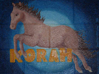
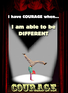
Character Attributes Poster
Recently I was told to create a poster based on the character attributes for students at Korah. I chose courage and created a poster using one of the performers in Seussical the Musical.
This is what I came up with:
There were also some questions that went along with it.
Reflection Sheet:
1.Describe how any of the design principles were used in the design of your poster. Be specific and use examples from your poster.
The principles of design are balance, proximity/unity, alignment, repetition/consistency, contrast, and white space. I think my poster used proximity/unity, alignment, repetition/consistency, and contrast. I used proximity/unity when I created depth by making my figure smaller and using large curtains. I used alignment when I placed my text and figure. I used repetition with my font and by using symmetry when it came to my background. I used contrast by using light font, a bright figure against a dark background.
2. What font(s) were chosen and why?
The fonts that I used were EDDIE and CLOWNINGWAY. I chose EDDIE because I wanted the lines that were used to describe courage to stand out but at the same time complement the writing underneath it. I used that font twice but in different sizes (36 and 48pt) and in the colours white and off white. I chose the CLOWNINGWAY font for the word COURAGE on the bottom because I thought it was very circus-y. I liked that because the picture that I cropped was from the circus scene in Seussical. I thought it suited the setting in the poster which was a stage.
3. How was colour used to attract attention?
For my background I used darker and more faded colours to really make the figure and the writing stand out. To draw more attention to the figure I created some spotlights, using grays and whites against a black background. I also used really light font colours, going from white to off white to a very pale yellow, in a descending way in order to pull the viewers eye in the direction of the figure, the colours helped with that process.
4. List any problems that were encountered in the design of your poster?
A few problems that I faced were creating good setting for the figure and making believable spotlights. The reason I cropped the figure was that the background wasn't what I wanted as it was unfocused. But by cropping the figure I had to make a new background and it took a while to decide on a decent setting. I settled for another stage and I pulled a picture of curtains from Photoshop. I then used a wooden floor image and adjusted the colors on it to make it appear darker. Then I took my figure and placed him accordingly, solving my background dilemma.
The second problem I had was the spotlights. As soon as I decided on a theater setting for my poster I knew I wanted spotlights on the figure to really make it look like a stage. So again I pulled a picture up, this on of a single spotlight. I then copied the picture and placed it but encountered my first problem. The spotlights met in the middle and overlapped each other, in a real picture when spotlights overlap that area is lighter. I had no way of creating that in Photoshop. So I tried to blur the image and erased the lines outline of the second spotlight to make it look more realistic. It turned out pretty well and so I left it as such.
5. List any improvements that could've been made to your poster.
I think that I could've improved the spotlights in my poster and possibly picked a different font for the first two lines of writing.
6. Rate the overall quality of your poster based on a level of 1-4, with 1 representing poor quality and 4 representing excellent quality.
I believe that the overall quality of my poster, based on a level of 1-4, should be a 3.
This is what I came up with:

There were also some questions that went along with it.
Reflection Sheet:
1.Describe how any of the design principles were used in the design of your poster. Be specific and use examples from your poster.
The principles of design are balance, proximity/unity, alignment, repetition/consistency, contrast, and white space. I think my poster used proximity/unity, alignment, repetition/consistency, and contrast. I used proximity/unity when I created depth by making my figure smaller and using large curtains. I used alignment when I placed my text and figure. I used repetition with my font and by using symmetry when it came to my background. I used contrast by using light font, a bright figure against a dark background.
2. What font(s) were chosen and why?
The fonts that I used were EDDIE and CLOWNINGWAY. I chose EDDIE because I wanted the lines that were used to describe courage to stand out but at the same time complement the writing underneath it. I used that font twice but in different sizes (36 and 48pt) and in the colours white and off white. I chose the CLOWNINGWAY font for the word COURAGE on the bottom because I thought it was very circus-y. I liked that because the picture that I cropped was from the circus scene in Seussical. I thought it suited the setting in the poster which was a stage.
3. How was colour used to attract attention?
For my background I used darker and more faded colours to really make the figure and the writing stand out. To draw more attention to the figure I created some spotlights, using grays and whites against a black background. I also used really light font colours, going from white to off white to a very pale yellow, in a descending way in order to pull the viewers eye in the direction of the figure, the colours helped with that process.
4. List any problems that were encountered in the design of your poster?
A few problems that I faced were creating good setting for the figure and making believable spotlights. The reason I cropped the figure was that the background wasn't what I wanted as it was unfocused. But by cropping the figure I had to make a new background and it took a while to decide on a decent setting. I settled for another stage and I pulled a picture of curtains from Photoshop. I then used a wooden floor image and adjusted the colors on it to make it appear darker. Then I took my figure and placed him accordingly, solving my background dilemma.
The second problem I had was the spotlights. As soon as I decided on a theater setting for my poster I knew I wanted spotlights on the figure to really make it look like a stage. So again I pulled a picture up, this on of a single spotlight. I then copied the picture and placed it but encountered my first problem. The spotlights met in the middle and overlapped each other, in a real picture when spotlights overlap that area is lighter. I had no way of creating that in Photoshop. So I tried to blur the image and erased the lines outline of the second spotlight to make it look more realistic. It turned out pretty well and so I left it as such.
5. List any improvements that could've been made to your poster.
I think that I could've improved the spotlights in my poster and possibly picked a different font for the first two lines of writing.
6. Rate the overall quality of your poster based on a level of 1-4, with 1 representing poor quality and 4 representing excellent quality.
I believe that the overall quality of my poster, based on a level of 1-4, should be a 3.
Monday, March 8, 2010
Johnny Rotten Is Giving Me Greys
So last week was interesting, I mainly worked on my poster and was given a new assignment. Sam and I are going to be creating t-shirts for the peer mediator and it's pretty cool. We also had a quiz in Comm Tech and of course I was studying minutes before the quiz. All through last week I was also diligently working on the Johnny Rotten picture for my friend. I've got to say that this is the most irritating and time consuming piece I've ever attempted and I decided to scrap it earlier on today. I've now started a new, larger version and it's coming along a lot better then the first. The highlight of my week would have to be seeing Alice in Wonderland.

I really liked the movie and thought visual effects were fantastic. The colours were lush and the scenery whimsical. I adore Johnny Depp and it was no surprise that he created another unique character. I also thought that Mia Wasikowska did a really good job as the main character Alice.
Monday, March 1, 2010
Currently Listening To: Giving Up The Gun
Well long time no speak, my dear blog.
Things have been hectic for the last while and so updates have been pretty much non-existent.
That said I'll guess I'll just fill you in on what you've missed.
Since my last blog I have been catching up on all my school work. From Philosophy to Comm Tech, everyone seems to be giving me homework these days. But I'm getting by and slowly getting back into the swing of things. I've decided to drop one of my courses, grade 12 Vocals, because I can't sing a note and Mrs. Williams, the music teacher, can't even salvage a voice like mine. It's okay though, I now have a free 4th period and get to leave early every other day which is pretty awesome.
I've just been told by Jenn and Sam that I shouldn't be babbling on about my other classes and that Mr. Wrigley is more concerned with what I've been doing in here.
Which hasn't been much, I'll admit.
In Comm Tech I've only just gotten used to Photo Shop, and am getting better with Sam's help, I've been using it to create a poster for one of the Character Attributes of Korah Collegiate. There are 12 Character Attributes; caring, citizenship, cooperation, courage, fairness, honesty, integrity, leadership, loyalty, perseverance, respect and responsibility. I've chosen leadership for my poster and am using pictures from Seussical the Musical to make it.
I'd actually finished a lot of it before I began a second project. Sam and I were supposed to be making t-shirts for a club here at school and to practice we each made our own designs. Sam drew her inspiration from Billy Talent and I from Andy Warhol. I made a simple Coke bottle cap design for a bag that used only red ink. Once I finished my design we quickly got a screen fixed up and last Friday we attempted to silk screen a bag.
It really was a good effort and for the first half hour things seems to be going smoothly. The exception being that the screen ricocheted back, hitting me in the chin, and leaving me with a sizeable bruise. Then, of course, the heater nearly crushed my finger.
It was the beginning of the end.
But we continued on and out first two prints turned out fantastically. They weren't perfect, but they had a rustic feel that worked and I thought I would be sporting a new bag by the end of class. But on the third printing I messed up and the ink smeared across the bag. It was finished but by then I had a bruise covering my and a sore finger so I didn’t mind that much.
Overall it was an eventful class and that’s what you’ve missed.
Tuesday, February 16, 2010
Opinion Piece #1
Hello,
This is my first blog and it was actually due about 3 weeks ago but due to a musical and the construction of a giant book, it was delayed. This blog is also my first assignment: to create an opinion piece on a chosen article on a current issue.
For this piece I read an article in the Toronto Star entitled "Can the web save papers?" In it the writer, Tyler Hamilton, discusses the release of the Ipad, a new type of tablet PC, and how technology similar to it will affect print, specifically newsprint.
After reading this article I have to say that I'm actually excited about the idea. This idea that in the future, and a near future at that as the Ipad was supposed to be release 60 days after it's announcement, I will be able to access the latest news in seconds and in a portable way. But more importantly this new way won't result in the loss of more trees.
That being said this is hardly an original idea, in fact many companies have been coming up with tablet PCs for a while now and digital books are becoming more common. Especially coming from a company like Apple, who's innovative gadgets are always sought after and rarely disappointing.
Which is precisely why, even though the tablet's been around for ages, I'm still fascinated by this 'new invention' by Apple.
This article only furthers my resolve to possibly purchase their latest product because of the idea that by spending the $400+ I'll not only be enjoying the coolest piece of technology around but I'll also be saving the environment.
I agree with the idea that the death of print through the creation of technology like this will result in a greener outcome because I see that as a better outcome then the situation we're currently working towards.
In conclusion, I think that the announcement of the Ipad opens up possibilities for a more environmentally friendly future. I would still think this even if it results in the death of print because, and here I had to quote Mr. Hamilton, "the spirit of journalism is more than just words and pictures on paper".
So, yah, that's it, enjoy :)
Subscribe to:
Comments (Atom)